Singular XQ
Next-Gen Intelligence For a Next-Gen Digital World


Does the Singular XQ website successfully help onboard users to support their initiative?

The Problem:
Early feedback on their website revealed some critical insights. The SXQ team want to use their website as a multimedia platform, but users struggled to complete their goal to find information to learn about the organization's goals and impact
Our Goal:
Through meetings with our client, the SXQ team was interested in updating their website to tackle this issue. Our project team decided to develop an effective landing page for their internal design team for future iterations of their company website.
Timeline:
3 months
Role:
UX Designer
Skills & Tools:
Figma, Miro, User Research, Information Architecture
Team:
Project team including 2 User Designers,
1 Product Manager, and 2 UX Design Consultants
Project Overview
Singular XQ is a non-profit organization focused on democratizing global communication and offering digital consulting for continuous technology education.
I led research and co-designed for Singular XQ's company website through revamping their information architecture and emphasizing their brand design on their landing page to address their target audiences' user goals
User Research
We expanded upon our research through identifying Singular XQ partners, donors, and members who recently joined their organization.
The main goal of these evaluations was to better understand user motivation for being affiliated with Singular XQ. Additionally, we wanted to know how they were introduced to Singular XQ prior to joining their mission?
KEY INSIGHTS


◆ A Hero section for first impressions on the Singular XQ mission
◆ Ease of navigation for an intuitive user flow for their stakeholders
◆ Accessibility to other Singular XQ digital platforms for a connected experience
◆ Spotlight outreach projects & programs for respective target audiences
◆ A feature to allow users to learn more about Singular XQ and their goals
◆ Multiple navigation features to quickly view the website
◆ A feature that helps users view their desired content while scrolling
Major Features
What the website needs
Market Research
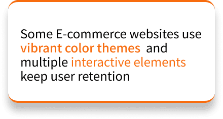
Our team engaged with Singular XQ with multiple comprehensive client interviews in bi-weekly Zoom meetings. Our discussions focused on critical assessment of their existing media platforms, identified key stakeholders, and evaluated the impact of prior initiatives for e-commerce websites. As such, further analysis of other e-commerce websites revealed gaps in the current website model:

We developed our different website users into distinct user scenarios. Our user scenarios encapsulate the type of user that is motivated to visit the website to learn more about Singular XQ.
After careful consideration with the SXQ team, we noted our personas' distinct backgrounds,
calls to action, and visualized their path to success for their goals through sparklines:

Ex. User scenario for our Individual Donor persona and their associated sparkline. Our team used this model to
properly illustrate each user and their ideal goal for visiting the website.
What is the typical user flow to navigate the new website as our end users?
What do they need to achieve their intended goal for visiting the website?


Beneficiary Partner
1.
Small businesses
Non-profit & Public Organizations
Technologist
2.
Users with extensive technical backgrounds
Individual Donors
3.
Independent private citizens interested in Singular XQ
4.
Organizational Donors
Independent institutions interested in Singular XQ
User Persona
After co-designing with our Singular XQ partners, we identified four primary personas that we envisioned interacting with all aspects of the website. These users are individuals interested in joining SXQ as beneficiary partners, technologists, individual donors, and organizational donors.
Our user personas were the best method for organizing our target audiences to illustrate a typical user for the website. Singular XQ and their mission draws a diverse range of stakeholders including the general public, beneficiaries, and prospect donors.

We found common patterns during the user journeys for possible webpages & sections for the website. As such, we visualized the website content with affinity diagrams to properly determine which webpage appeals to each stakeholder’s call to action and their actionable goals.

Affinity Diagram
Our strategy is to refocus the website’s design, sharpening the articulation of SXQ’s mission and using the website’s content to weave a narrative around the company's efforts and the pivotal role of open source, to drive increased traffic to existing projects and elevate overall awareness, fostering deeper user engagement

Using the groupings from the affinity diagram phase of our design process, we created an information architecture for the redesigned version of SXQ’s website with a sitemap format.
From this, we created five main pages or subsections that corresponded with each affinity diagram that would be linked in the website’s site navigation including who we are, partner with us, learn with us, join our community, as well as a footer/other section.
Wireframes & Prototype
Calm Design avoids agitating the audience and aligns with SXQ’s ideology of promoting responsible technology.
Our partner wanted us to create a calm feeling in contrast to vibrant color themes in multiple interactivity that forces the audience's attention. Make great use of white spaces, with grey blocks in between to avoid monotonous visuals, etc.


Visual Analysis: Hubspot
Visual Analysis: Calm Design Pallete
Visual Analysis: Mozilla Foundation
Muted Colors
Minimalist
Cohesive
Visual Analysis
Before continuing with our high-fidelity prototype, my team and I engaged in visual analysis with other e-commerce websites to reflect similar visual designs sensibilities
We created our low-fidelity prototype in Figma to visualize our information architecture. Following the information architecture design, the headers specify the landing page’s structure and the order in each section is listed for the website's visual hierarchy.
We used this iteration to identify the user flow for engaging in usability testing and the final design:
Low-Fidelity Prototype

Final Design
High Fidelity Prototype
Finally, with the visual analysis in mind, we added extensive content details and visual designs to the high-fidelity prototype. The final prototype exhibits calm design while keeping the Singular XQ brand at the forefront.